Re-drawing the Barrie Transit map
Every good city has a public transit system, and every good transit system has a map. But not all maps are drawn equal, and so over the past year or so I’ve spent some of my spare time re-drawing my city’s mediocre bus map, using these rules I came up with:
- The routes are the roads
- Routes must be easily traceable
- Use the correct scale
- Anticipate confusion
I’ve long admired some of the maps posted on Cameron Booth’s Transit Maps blog, and thought that I could make my own map too. How hard could it be? Quite hard, as it turns out.
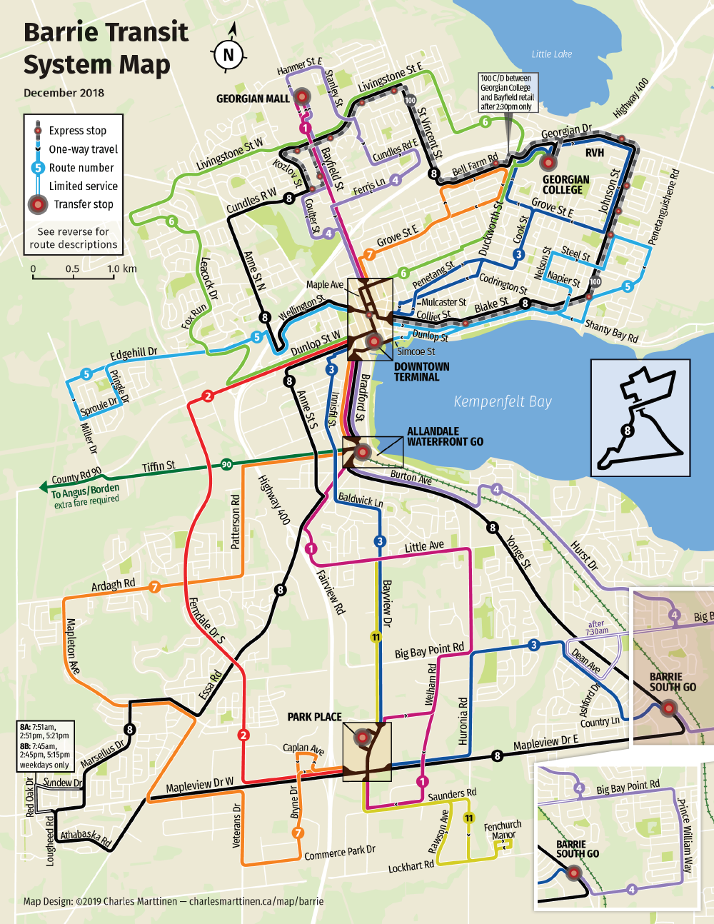
Re-drawn
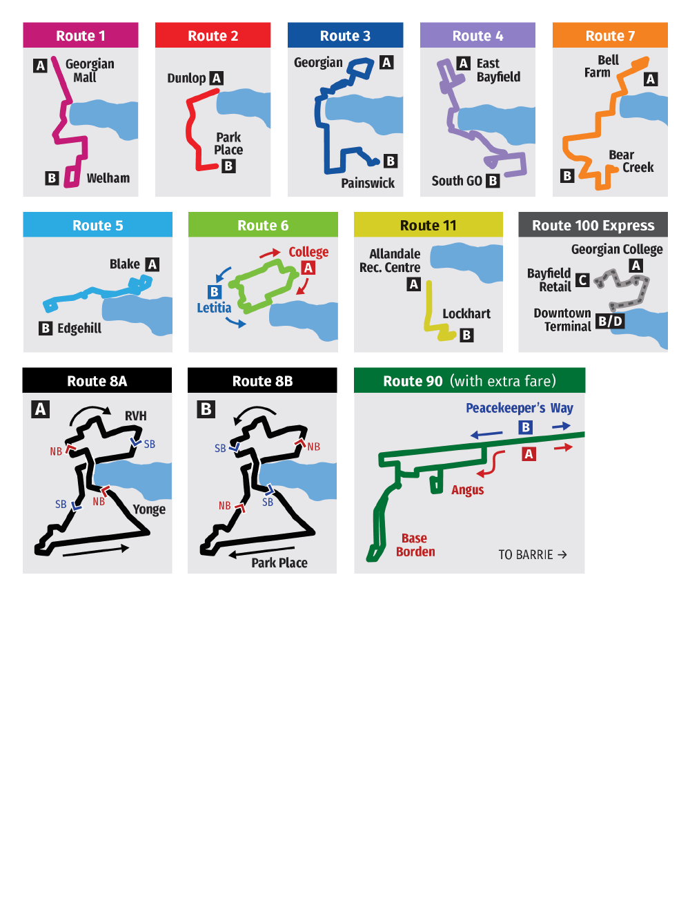
Here’s the new map, front and back:
What’s wrong with the old map?
Note: As I was writing this, Barrie Transit made their own update to the map, coming to many of the same conclusions as I did. Their new map is a huge improvement over the old one, but still not great. However, I will continue to reference the old version, since that is what existed when I was making my map.
It’s ugly, inconsistent, and hard to read. Just look at it:
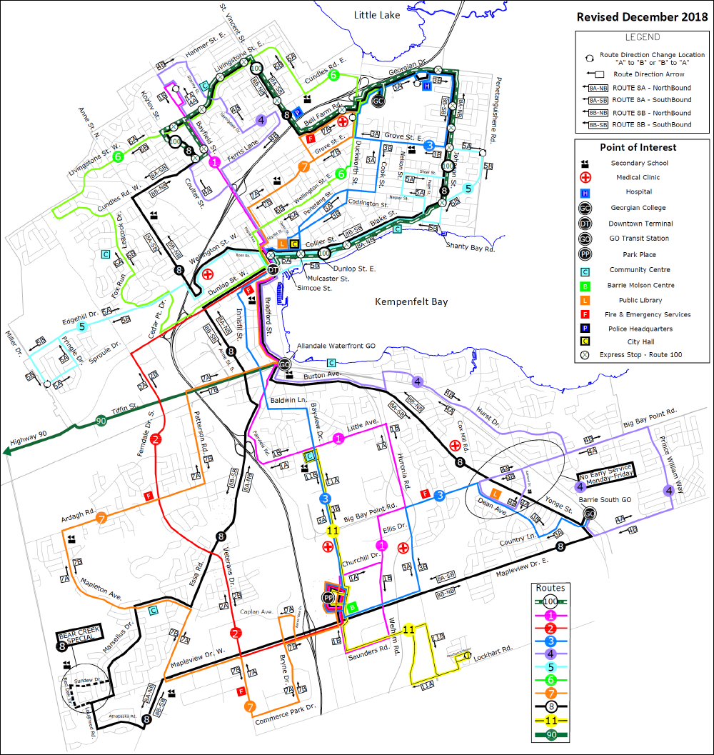
It doesn’t seem like much thought has been put into this map at all. Colours are atrocious (routes 5 and 6 almost disappear into the white background), the route lines are too thin, imprecisely placed and unnecessarily overlap each other, road labels are randomly placed and sized, and there are too many arrows and unnecessary map elements competing for attention (why do fire stations need to be on the map?). It looks like someone misused GIS software to make it, and I suspect that that’s exactly what happened.
The map is usable though, I’ll give it that. Only roads that buses travel on have been labelled, the streets themselves don’t compete for focus with the route lines, and it’s small enough that it can be printed on tabloid (11" x 17") paper. It’s not great, but it’s better than drawing multi-coloured lines on a wall-size folded street map, which is what Grand River Transit in Kitchener-Waterloo did, resulting in something completely unusable:
Making it better
At it’s core, the old map works—it’s just super badly made. So I’ll make it again, but better, starting with the rule that…
1. The routes are the roads
In other words, if transit vehicles do not travel along a road, that road is no longer relevant, making the transit routes the real “roads” on the map. That means that they should be the main focus, and anything else should be toned down or omitted altogether.
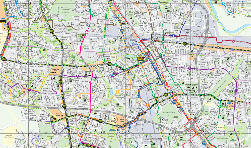
Below is a portion of the Toronto Transit Commission’s system map that demonstrates this concept. It is clear to see that if every physical road was present, the map would devolve into a cluttered mess.
But that doesn’t mean a transit map can’t show roads! Roads provide an important function, and that is to provide context. A simplified map might look pretty, but if you can’t place yourself on it, it’s a bit useless. However, too much context isn’t much better, as the GRT map I referenced earlier demonstrates. There should be enough detail to provide context, but not so much that it results in information overload.
Barrie’s bus routes wiggle all over the place and don’t create a clear picture of the city the way grid-based systems do, so omitting roads entirely won’t do. Luckily, the city is small enough that all of its roads can be clearly rendered as thin, light lines on a bottom layer without detracting too much from the route lines, which are thick and dark. White keylines are used on the route lines to increase contrast with the background.
This leads us to the next rule.
2. Routes must be easily traceable
It’s not enough that the route lines are the main focus; they need to be clearly differentiated from each other. That means using colours, labels, careful placement, or other means to ensure that one route line is never confused for another.
Ideally, each route line is a different colour, but many bus systems have too many routes for this, which is the case in Toronto. If you scroll back up to the Toronto map, you can see that they’ve resorted to using labels to identify individual routes, and line thickness and colour to communicate service frequency and type (see the legend below). This works well for Toronto because of its grid-based road network, where routes mostly trace the straight roads and are easy to follow.
Such a strategy would not work for Barrie, however. Many of its bus routes cover similarly large areas and overlap each other along portions of their routes, which would make tracing the lines difficult. (These characteristics are partly because of the city’s somewhat convoluted road network around Kempenfelt Bay, but also because one of the system’s goals is to transport riders to their destinations with a minimum of transfers.)
Luckily, there are few enough routes in Barrie’s system that each can be assigned a colour. I chose colours that stand out on their own but are not likely to be confused with one another, even when printed in greyscale.
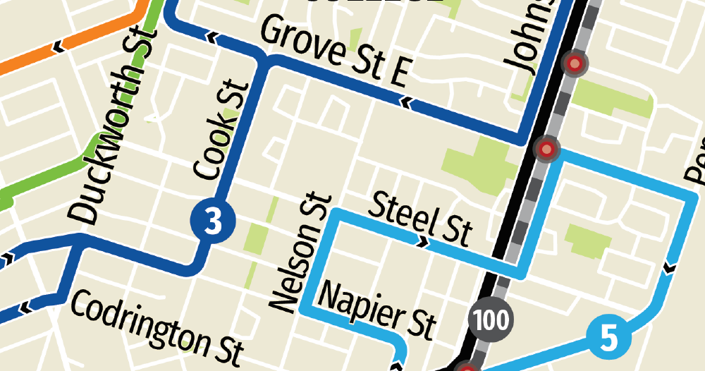
I also took care to ensure that the thick lines are equally spaced apart and overlap a minimum of times, making it as easy as possible to follow the route from end to end. On some parts of the map, this worked really well and the routes fit together like puzzle pieces. You can see this in the north end:
But elsewhere, where multiple routes travel along the same roads, it’s a cramped affair. You can even see this on the old map, which uses thin route lines:
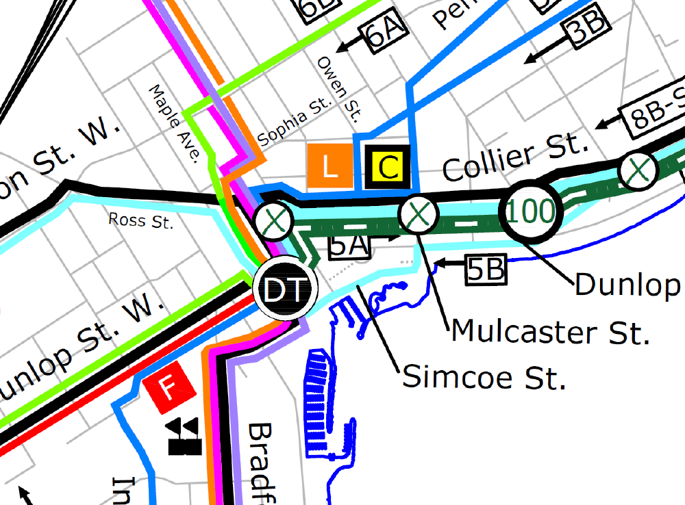
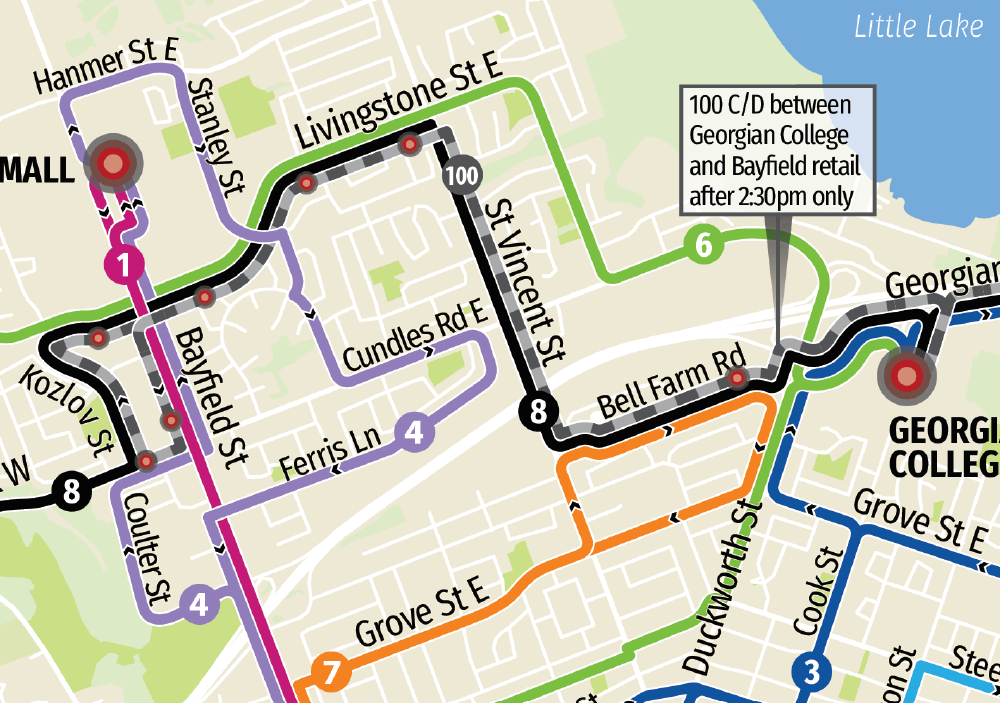
This is usually solved by using an inset area of the map, but I decided to try a different approach that I call x-ray lenses. This is a box over an area of the map that cuts through the clutter by concentrating multiple routes into a single line:
The area within the box is small enough that we can rely on users to use simple deduction to determine where exactly routes run. Notably, all three of the x-ray lenses are placed over major transfer stops that all buses stop at. (It wasn’t necessary on this map, but the x-ray lens could also be paired with an inset if the area within the lens is too complicated to follow on its own.)
This approach was inspired by Transport for London’s bus spider maps. Although not quite the same thing, TfL’s spider maps show a regional hub as a central map without route lines with spider lines for each route spreading out from each side:
As you can see, drawing route lines on a map isn’t as simple as it looks. The process requires a lot of thought and can’t really be automated. But it’s all for naught if the map isn’t legible at the scale it will be used.
3. Use the correct scale
There are so many great maps on the Transit Maps blog that suffer from one major flaw: they’re too big, or the elements on the map are too small. Their designers make them on big computer monitors and make heavy use of the zoom function, but forget that these maps are destined for pocket maps, low-res home printers, and worst of all, phone screens. As a result, they are often illegible and ultimately not very useful—however beautiful they may be.
Deciding on a page size and scale should really be the first thing you do, because going back to change it afterwards often means re-drawing the entire map. Seemingly trivial actions like changing the thickness of route lines becomes time consuming when multiple lines run in parallel and each line on the map must be re-drawn with the correct spacing.
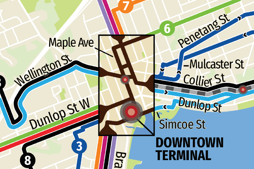
From the beginning, my goal was to fit the map on a standard letter size page (8.5" x 11") with a minimum font size of about 10 points, and although it’s a tight squeeze, I was able to make it work. One major compromise I had to make was moving a small section of the map that stuck off the edge of the page into an inset, but the alternative was to shrink the entire map. Also, if you look closely, you’ll notice that the map is rotated about 10° clockwise, which allows the map to fill more of the page.
Using the correct scale means making labels and other elements large enough to read at a distance, and that often means making compromises. Nice-to-haves like common points of interest are no longer nice to have when their inclusion interferes with more important parts of the map. Earlier versions of my map included such things, but I quickly realised that a map that tries to do too much does none of it well. And that only makes things confusing (again, refer to the GRT map near the beginning).
4. Anticipate confusion
But sometimes confusion is caused by something a little more insidious: ambiguity. When you become intimately familiar with a design, it’s easy to overlook when it fails to communicate the intended message. To anticipate what parts of the design may cause confusion, step into the shoes of someone totally unfamiliar with the system and see it from his point of view.
One of the first times I used the Barrie bus system highlighted such a problem with the old map. I remember being at the Downtown Terminal and trying to figure out which one of four Route 8 buses I should be boarding: 8A-NB, 8A-SB, 8B-NB, or 8B-SB. A confusing experience to be sure, because Route 8 (an amalgamation of two previous routes) actually crosses itself in the middle, and the old map does a bad job of communicating this unusual service pattern.
To fix this, rather than going straight to using a plethora of miniscule labelled arrows spread across the page like the old map, I took a step back and realised that in the general case, each route has two important pieces of information attached to it: where it runs, and the direction/destination nameboards of buses that drive it. Importantly, these are two separate concerns that don’t necessarily need to be presented together. This is because (for example) the passenger first identifies that Route 2 takes him where he needs to go, and only then does he care whether he needs to take ‘2A Dunlop’ or ‘2B Park Place’.
Critically, this means that route destinations/directions don’t need to be on the map at all, and can instead be shifted to the reverse side of the map and rendered as simple single-purpose graphics:
These graphics also serve as succinct icons for each route that would work well on the front of a timetable booklet.
This still doesn’t solve the problem of deciphering Route 8’s ambigous figure-eight route while actually using the map, but an even simpler graphic does the job nicely:
Fin
The rules above are by no means conclusive, but simply serve to illustrate the thought process I used when designing the map.
This project began as a personal challenge to become adept at using Adobe Illustrator and InDesign, but like everything I do, it soon ballooned in scope from a simple throwaway project into a complete re-design, along with per-route timetable/map booklets (which I will write about at a later date). I’m still not totally happy with it, but at a certain point I had to say “enough” and call it good.
It was not originally my intention to document the process, but last year I came across a brilliant article called Practically Redesigned: British Train Ticket [Internet Archive] that inspired me to try. Having not written anything significant since high school, my first draft was complete rubbish, and arriving at what you have just read took several weeks and multiple complete re-writes. Hopefully it won’t take so long next time.
Download
You probably want the 2020 version. If not, the old version is still available here.
Except where permission has been otherwise granted, this map:
- May be used for personal, non-commercial purposes only.
- Must not be distributed from any other location except this page.
Download high resolution PNG images: Front, Back.
2020 version
I made an update to the map in late 2020, which I wrote about here. Go check it out!